A new pharmacy, from counter to mobile.
FAOL is a concept for an online pharmacy developed for an Italian retailer of health and beauty products. The client was a well established business that has operated as direct seller and wholesaler for decades, but didn’t have an online presence yet.Going online represented a major innovation for the company, while for the project it meant designing a whole new service from scratch. Within a remote team of four people based in three countries, I covered the role of product designer: I led the design of the service and of the UX and supported both the visual design and the front-end development.
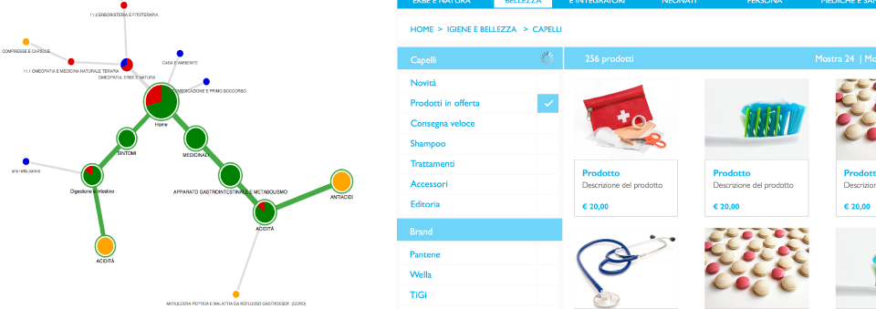
I started creating the service blueprints, then I worked on the IA in order to adapt the structure of the existing warehouse database into an intuitive navigation menu. After validating the IA with users, I designed the wireframes for the responsive website and put together some mockups.
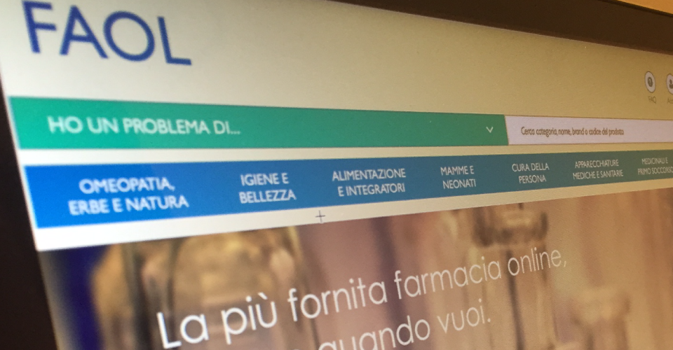
Designing the IA, between painkillers and shampoo.
The IA was a real challenge. With a catalogue of hundreds of thousands of products ranging from pain killers to furniture for pharmacies, to hypoallergenic makeup, the risk was to overwhelm the users with too much choice, or worst, to bury categories making it impossible to find them. The specialist nature of the domain of knowledge also made design choices more complicated.
My solution was based on the introduction of a double-access navigation. I designed a global menu that reflected the most relevant contexts of use identified during a preliminary study, then I added a faceted navigation that relied on the database's metadata to provide a parallel menu based on symptoms.
Given the complexity of the IA I wanted to validate my assumptions with some users representative of the audience. In only a couple of days I created and sent out an online tree-test where I asked people to find some key products in the provided menu. The results showed that everyone loved the symptoms based navigation and also pointed out some bits of the menu that were not clear, helping me to understand how to adjust the navigation.
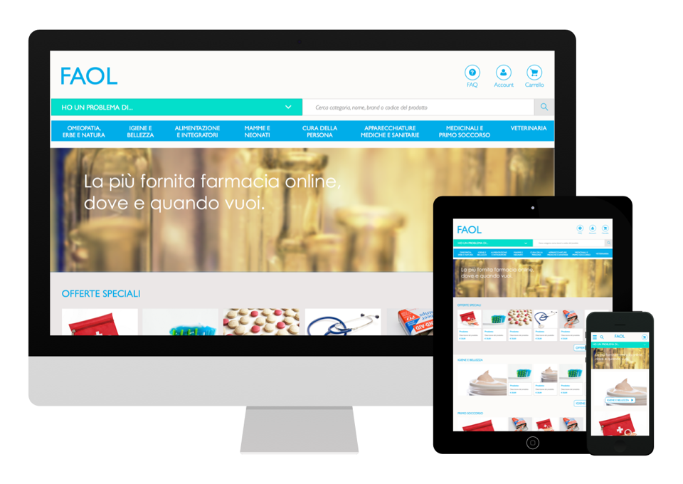
Mobile-first approach.
The service was designed to be responsive. I used high level wireframes and mockups to communicate the priority of contents in each of the three screen sizes: mobile, tablet and desktop.