
A one-stop-shop to help field engineers staying safe.
The project was commissioned by Schlumberger, a leading engineering company, to redesign one of their internal websites providing crucial information on health and prevention.
The existing website represented a hub for field engineers to access both a huge amount of information about safety and prevention, and a number of internal tools and applications where they could pull out updated data about accidents and KPIs in their segment. The employees regularly accessed the hub to take mandatory training and to find contents and data needed to compile reports, however, for them it was a terrible experience since the content was hidden in a confusing and incomplete IA, and poor layout.
To make it all even more complicated, each topic section was managed independently by subject matter experts, hence the types of content could vary from a simple news to interactive maps.
For the solution, with the team we decided to move away from the portal model, since we wanted to create an more intuitive and comprehensive experience of finding contents and data, so we built the new solution on a combination of filters and widgets.
The new solution included: A new IA that provided a clearer navigation and surfaced personalised content based on the role and location of employees; The integration of data from other applications; A modular structure that could be adapted to different types of content.
For this project I covered a double role of project manager and designer. On one side I looked after the team coordination, the communication with the client, milestones and budget. On the other side I led the discovery phase and worked on the interaction design, creating the new IA map, the personas and user journeys document and several iterations of annotated wireframes.
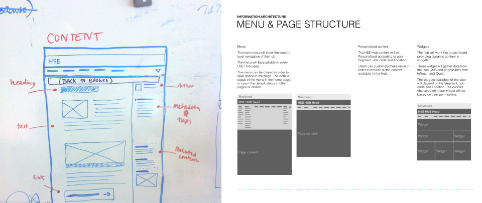
User needs and team sketching sessions.
During the discovery phase I gathered the user needs through a set of interviews with the subject matter experts and a user workshop.
Then I used the findings to work on the solution with the visual designer and the front-end developer. The design documentation illustrated the flexible structure of the layout, highlighting the customisation element and the browsing workflow.
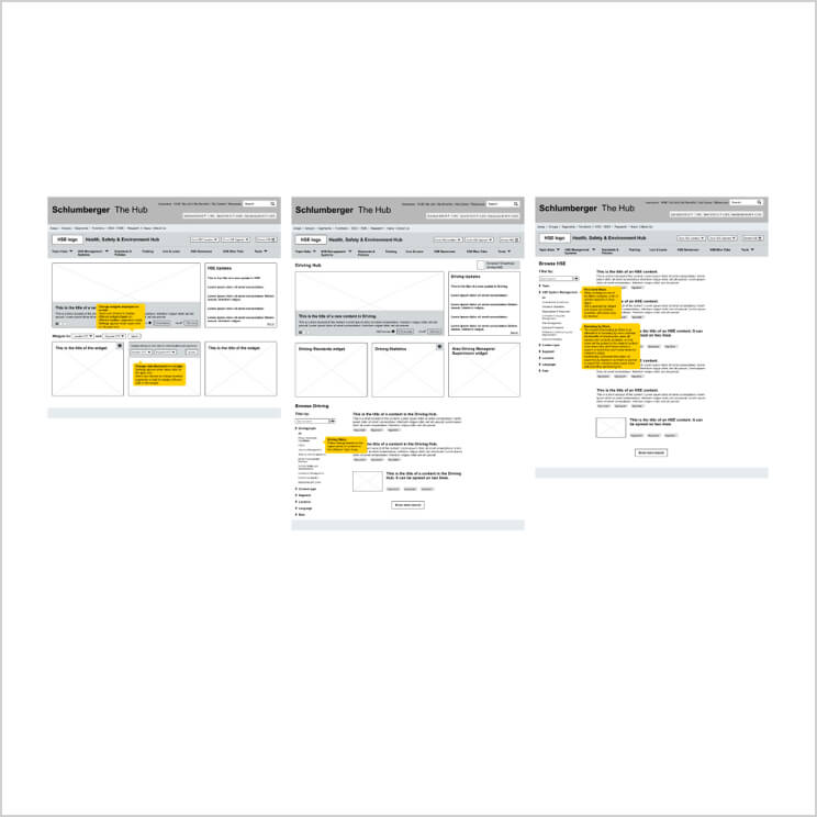
Wireframes.
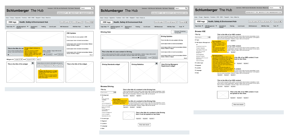
The new hub did a much better job in presenting contents.
The wireframes showed the new workflow of finding relevant data and contents.
In the home page, employees can see at a glance new contents recently added to the hub and a live feed of data pulled from other internal systems. They are also able browse contents by navigating to each topic section or by browsing all contents in the hub.
Once in the ‘Browse’ page, a blog-style feed shows all available contents, then users are able to narrow down results through dynamic filters.
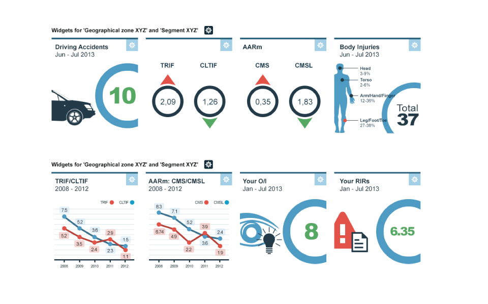
The widgets show updates from other applications, which is a big step forward for the employees, who previously had to pull out these data manually from one application at a time when compiling their reports.
Topic sections can be found from the main navigation. Once in the topic sections, the same browsing style of the home is replicated but contextual to the subjects relevant for each topic.
Show me the data.
As part of the new design I also designed some mockups for the data visualisation in the widgets. I applied a clean style with solid colours and simple illustrations.