
Wikipedia
Wikipedia has been around for almost two decades and it has hardly updated it's UI design.
While there's a lot that could be improved on its website, it provides a great experience for both browsing and contributing.
Landing page
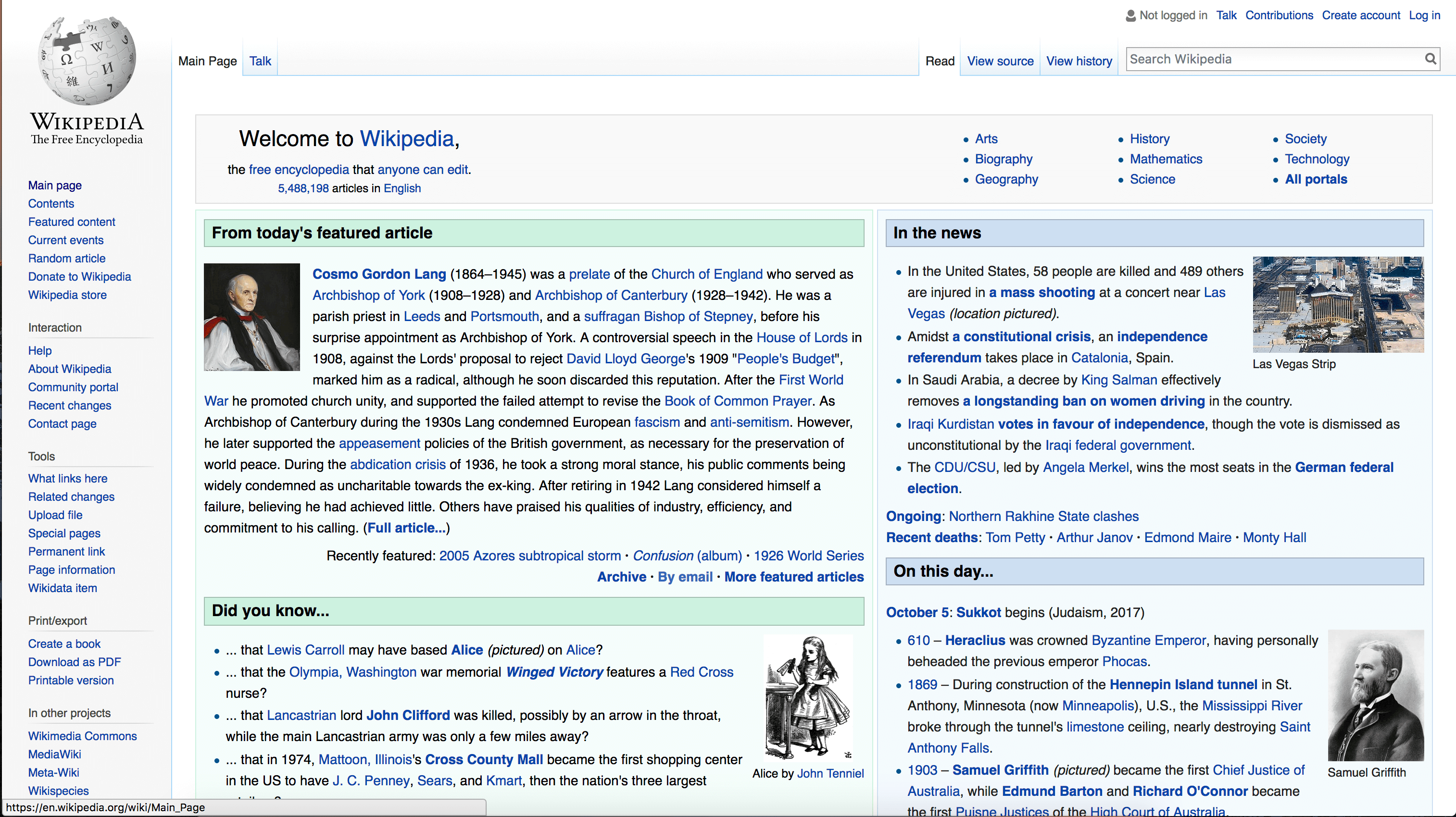
Most users won't start their journey from the landing page, as they'll most likely arrive on the article page from a search. However, Wikipedia's landing page ticks some important boxes:
- The header tells users straight away what they can do here: "the free encyclopedia that anyone can edit";
- On the right there's a high level menu to start navigate the contents by subject;
- The search bar, its most important feature, is right where users expect to find it, on the top right corner;
- Predictive search helps users finding what they're looking for more easily, even when they're not sure what it's called;
- The side navigation provides a guidance on the website sections, helping users getting their head around the website's structure;
- On the page, there are different types of information nuggets, reinforcing Wikipedia's USP as knowledge provider.
To improve the performance of the page, I'd give the search bar a more prominent position on the page and I'd also move up the links to other Wikimedia Foundations projects, that are currently signposted at the bottom of the page.
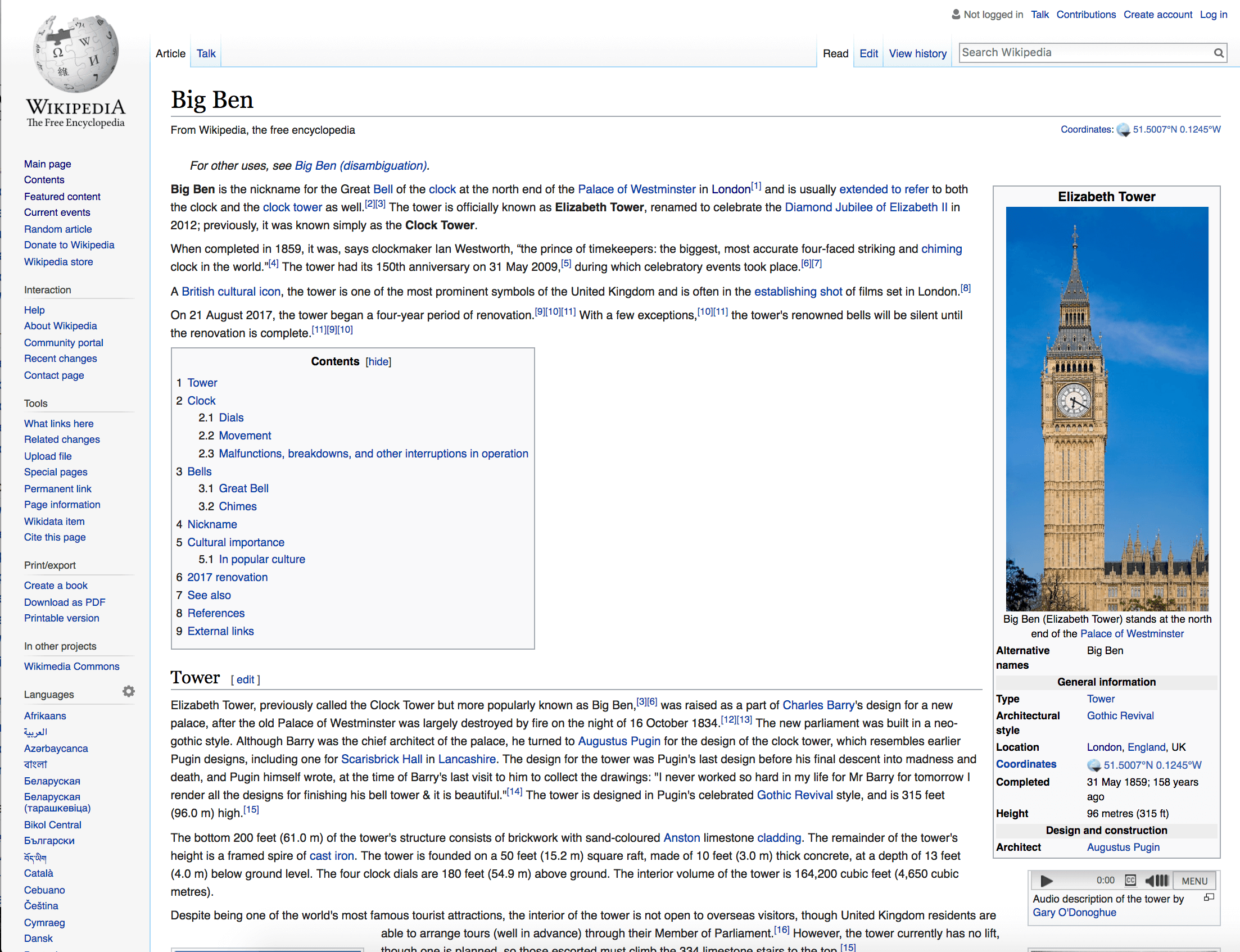
Article page